


Small Teams: Build a One Page Social Media Style Guide With Templates
- Elana Rheinhart
- 3 days ago
- 19 min read

A social media style guide is the one document that tells everyone on your team, and every freelancer you hire, exactly how your brand sounds, looks, and behaves on every platform. If you’re starting from zero, your first move is simple: build a one-page TL;DR voice card and one working post template today. That alone stops the daily guesswork that makes small business feeds feel scattered.
TL;DR:
A social media style guide should include active profile ownership, a one-page brand voice card, locked visual assets, and at least one reusable post template for consistent branding.
Define your brand voice with three adjectives and list specific always/never language rules to ensure clear, authentic communication across platforms.
Lock visual elements like colors, logos, and fonts in writing, and designate a single owner for template updates to prevent visual drift over time.
Establish platform-specific tone guidelines and formatting rules, emphasizing caption structure, hashtag management, and accessibility practices like alt text and captioning.
Review and update your guide quarterly for small adjustments and annually for overall relevance, with owner accountability to ensure ongoing adherence.
What Is a Social Media Style Guide, and What Should It Cover?
A social media style guide is a single reference document that defines your brand’s voice, visual rules, and posting standards across every platform you use. It exists to answer the small, repetitive questions that eat up a social media manager’s day: Do we use an exclamation point here? Is this the right blue? Can we repost this customer photo? Without a written answer, every person touching your account makes a different call, and your feed starts to look like it has multiple owners.
The most effective guides cover eight areas, based on how top agencies and brand teams structure theirs: your social profiles, brand voice and tone, visual identity, language and grammar rules, caption formatting, hashtag conventions, governance, and legal or accessibility guardrails. Hootsuite’s style guide framework adds one more layer that’s increasingly relevant: rules for how AI tools can and can’t be used in your content pipeline, from caption drafting to image generation.
Here’s the part that trips up most small business owners: a style guide is not the same thing as a brand book. A brand book defines your logo and colors for print, packaging, and your website. A social media style guide translates those same brand fundamentals into platform-specific decisions, like how your logo shrinks on a mobile feed or how your formal tone loosens up in an Instagram Reel caption. You need both, but the social version is the one your team will actually open every day.
Small teams often skip this step because “everyone already knows how we sound.” That works fine until you hire a second person, bring in a freelancer for a launch, or take two weeks off. That’s exactly when inconsistency shows up, and it’s the reason content consistency has to be written down, not just understood.
Fast-Start Checklist and 3-Step Launch Plan
You don’t need a 40-page manual to get consistent. You need the right sections and a plan to fill them fast.
Every usable guide, no matter how small the business, should include:
A list of active social profiles and who owns login access
A one-page voice card defining tone and three words that describe your brand personality
Locked visual assets: colors, logo files, fonts
Caption formatting rules and CTA placement
A hashtag list, split into core and rotating sets
At least one reusable post template per content type
A named guide owner and an approval process
A breaking-news pause policy
Here’s your three-step plan to go from nothing to a working guide in one afternoon:
Step 1: Audit your profiles. List every active account, note who has admin access, and flag any bios or profile photos that are out of date. This takes 20 minutes and often reveals an orphaned account nobody remembers creating.
Step 2: Build your voice card. Write three words that describe your brand’s personality, list five “always” words and five “never” words, and write two sample captions. This is the single page people will actually reference, according to Buffer’s guidance on style guide adoption.
Step 3: Build one template and publish. Pick your most-used post type (probably a product shot or a quote graphic), lock the logo placement and font, and leave the headline and image swappable. Publish it. Iterate next week.
Starter rule for locked vs. flexible elements: logo, color, and font are always locked. Headline text, image choice, and caption wording are always flexible. Everything else gets decided as you go.
How to Define Brand Voice and Tone by Platform
Voice and tone are not the same thing, and confusing them is why guides fail. Your voice is your brand’s fixed personality, the way a person doesn’t change their sense of humor depending on who they’re talking to. Your tone is how that personality adjusts to context: a customer complaint gets a different tone than a product launch, even though the voice underneath stays identical.

The fastest way to nail down voice is the three-word test. Pick three adjectives that describe your brand if it were a person walking into a room. A boutique fitness studio might land on “energetic, direct, encouraging.” A family-run accounting firm might choose “steady, warm, plainspoken.” Write those three words at the top of your voice card, because every caption you draft should sound like it came from that person.
Tone shifts by platform even when voice doesn’t:
Instagram: Warmer and more visual-first; captions can be conversational and slightly playful, leaning on the brand’s personality more than its authority.
LinkedIn: More measured and outcome-focused; the same brand sounds more professional here without losing its core personality.
TikTok: Loosest and most immediate; short sentences, direct address, and a willingness to be a little irreverent if that fits the three-word test.
Replies and DMs: Personal and specific; this is where tone gets warmest because you’re talking to one person, not a feed.
Build an always/never list so writers don’t have to guess:
Always: first-person plural (“we”), contractions, specific product names, a clear next step. Never: corporate jargon, exclamation-point stacking, ALL CAPS for emphasis, apologizing for typos in public replies.
Sample captions bring the rule to life faster than any description. For a feed post: “New batch just dropped. Grab yours before Friday.” For a reply to a compliment: “This made our whole day. Thank you for saying so.” For a reply to a complaint: “We hear you, and we want to fix this. Can you send us a DM with your order number?”
Pro Tip: Write your voice card in the words your best employee already uses when they talk about the business out loud. That’s your real voice, not the version that sounds good in a boardroom.
What to Lock In Visually: Colors, Logos, and Templates
Visual drift happens faster than voice drift because it’s invisible until someone puts two posts side by side and notices the blue is slightly off. Lock these details down in writing, not just in memory:
Hex codes for primary and secondary colors, written exactly (for example, #F5A623), not described as “orange.”
Logo variants: full logo, icon-only mark, light-background version, dark-background version.
Minimum size and clear space: most brand guides specify a logo can never shrink below a set pixel width and needs a fixed margin of empty space around it, a rule borrowed from institutional guides like Immaculata University’s social media brand guide, which documents exact sizing and approval steps small teams can adapt directly.
Fonts: one for headlines, one for body text, plus their web-safe fallback if a design tool doesn’t have the license.
Photography and illustration style need concrete examples, not adjectives like “clean” or “modern,” because those words mean something different to everyone on your team. Show a do and a don’t side by side: “Do use natural light and true product color. Don’t use filters that shift skin tone or add heavy vignettes.” If your brand uses illustration, specify the line weight, whether characters have visible facial features, and which stock illustration sites are approved.
Templates need a home and an ownership rule. Most small teams keep working templates in Canva or Figma, since both let you lock specific layers (logo, color blocks, fonts) while leaving text boxes and image slots open for editing. According to Hootsuite’s research on style guide tools, keeping templates where your team already works, rather than in a separate design archive, is what actually gets them used.
Write down who can edit locked elements. In most small businesses, that’s one person: the guide owner or a designer they’ve approved. Everyone else works inside the flexible fields only. That single rule prevents the slow visual drift that happens when five different people each nudge the logo “just slightly” over six months.
Language, Grammar, and Caption Formatting Rules
Grammar rules save time because they end the back-and-forth over small edits before a post ever gets scheduled. Set your defaults once:
Oxford comma: pick yes or no, and apply it everywhere, including captions.
Numbers: spell out one through nine, use numerals for 10 and above, except in stats or prices.
Contractions: allowed and encouraged in nearly every context except formal announcements.
Exclamation points: cap at one per caption, never stacked.
Brand name: written exactly as styled, every time, including mid-sentence.
Caption structure works best as a repeatable formula: hook, body, call to action. The hook is your first line, and it has to work even if the caption gets cut off, since most platforms truncate after one or two lines on mobile. The body delivers the actual information or story. The CTA tells the reader what to do next, whether that’s commenting, clicking a link, or visiting a store.
Ideal caption length varies by platform. Instagram performs well with short, punchy captions under 150 characters for feed posts, though carousel captions can run longer to add context. LinkedIn rewards longer, more detailed captions that read like a short article. TikTok captions work best short, since the video itself is the message. X has a hard character limit that forces brevity by default.
Emoji policy needs a rule, not a vibe. A workable default: one to three emoji per caption, placed at the end of sentences rather than mid-word, and never replacing words a reader needs to understand the sentence. Healthcare and financial brands often cut emoji entirely in favor of a more formal register, and that’s a valid choice as long as it’s written down so nobody adds one by habit.
CTA placement should sit at the end of the caption, not buried in the middle, and should ask for one action at a time. “Comment your favorite below” works. “Comment your favorite, tag a friend, and check the link in bio” asks for too much and gets none of it.
How to Document Hashtags for Consistent Use
Hashtags need the same discipline as your color palette, because a hashtag list that lives only in one person’s head disappears the day that person goes on vacation.
Build two tiers. Your core brand hashtags are three to five tags you use on nearly every post, tied to your business name or tagline. Your rotating niche tags are a larger pool, maybe 15 to 20, that you swap in based on the post’s topic, season, or campaign. Keep both lists in a shared document, not in someone’s notes app.
Platform rules differ enough that a single hashtag strategy won’t work everywhere:
Instagram: supports up to 30 hashtags, but most brands see better engagement with 3 to 8 relevant tags placed in the caption or first comment.
TikTok: works best with 3 to 5 tags directly in the caption, mixing a broad discovery tag with a specific niche one.
LinkedIn: 3 to 5 tags maximum, placed at the end of the post, and skewed toward industry terms rather than trending phrases.
X: 1 to 2 tags at most, since hashtag-heavy posts read as spam on that platform specifically.
Maintain the list in whatever tool already holds your content calendar, whether that’s a shared spreadsheet or a project management board, and assign one person to review it quarterly. Trends move fast enough that a tag set built a year ago is probably stale, and a rotating niche tag that never gets refreshed stops pulling new eyes to your posts.
Reusable Post Templates and Asset Ownership
Templates are what turn a style guide from a reference document into something your team actually uses daily. Buffer’s research on style guide adoption found that a handful of reusable templates does more for consistency than pages of written rules, because templates remove the blank-page problem entirely.
Five template types cover most small business content needs: a carousel for tips or lists, a quote graphic for testimonials or team wisdom, a product spotlight, an announcement format for news or launches, and a repost frame for user-generated content. For each one, lock the logo, color scheme, and font, but leave the headline, photo, and body copy open for whoever is building that day’s post.
Ownership should be written down per template, not assumed. Here’s a sample structure a small team might use:
Template Type | Locked Elements | Editable Fields | Owner |
Carousel (tips) | Logo, color bar, font | Headline, slide text, order | Social manager |
Quote graphic | Logo, background color, font | Quote text, attribution | Social manager |
Product spotlight | Logo, price tag style | Product photo, description | Content creator |
Announcement | Logo, header treatment | Headline, date, details | Owner or manager |
UGC repost | Logo frame, credit placement | Reposted image, caption | Social manager |
Store templates where your team already builds them, whether that’s Canva or Figma, and keep one master version locked so nobody accidentally overwrites the base layout. A simple version-control habit works fine for most small teams: rename the file with a date each time you make a structural change, and archive old versions instead of deleting them. That way, if a locked element gets edited by mistake, you can revert without redoing the whole design.
Platform Cheatsheets: When to Cross-Post vs. Customize
Cross-posting the exact same asset to every platform is the fastest way to look like you’re not paying attention to any of them. Here’s the shorthand version of what changes where:
Instagram: visual-first, moderate hashtag use, captions can run longer on carousels than single images.
TikTok: vertical video only, minimal hashtags, caption is secondary to the video itself.
LinkedIn: text can carry the post alone, hashtags stay industry-specific, tone tightens up slightly.
X: character limit forces brevity, hashtags almost disappear, timing matters more than on any other platform.
Facebook: works well with slightly longer captions than Instagram, and links perform better here than on most other platforms.
Pinterest: vertical images with text overlay outperform plain photos, and keyword-rich descriptions matter more than hashtags.
The decision flow is simple: if the format works natively on a platform (a square product photo, a short quote graphic), reuse the asset but rewrite the caption for that platform’s tone and length. If the format doesn’t translate, like a 15-second vertical video built for TikTok, don’t force it onto LinkedIn as-is. Recut or reformat before you post.
Keep exact sizing specs, like ideal pixel dimensions for each platform’s feed and story formats, in a separate internal reference so your style guide itself doesn’t get cluttered with numbers that change every time a platform updates its app. Link that resource from your guide so anyone can find it in one click, and pair it with broader post format ideas so your team never runs dry on what to actually post.
Who Owns the Guide, and How Often Should It Change?
A style guide with no owner turns into a static PDF nobody opens after the first month. Assign one person as the guide owner, usually your social media manager or the business owner in a very small operation, and give that person final say over updates.
Set approval levels based on stakes. Routine posts, like a daily product photo or a scheduled promotion, should need zero approval if they follow the templates already locked in the guide. Campaigns, rebrands, or anything touching a sensitive topic should go through a second set of eyes before it publishes.
Emergency rules matter more than most small businesses expect. Build a breaking-news pause policy into your governance section: if a major news event breaks, whoever is managing the account that day has the authority to pause all scheduled posts immediately, no approval needed. Sprout Social’s framework for style guide governance recommends this exact kind of pre-authorized pause, because waiting for sign-off during a fast-moving news cycle is how brands end up posting something tone-deaf next to a tragedy.
Review cadence should be lightweight. A quarterly check-in, even a 20-minute call, catches stale hashtags, outdated bios, or a voice card that no longer matches how the business has evolved. Once a year, do a fuller audit: read through every template, confirm every locked visual element still matches your current brand assets, and archive anything that’s no longer relevant.
Pro Tip: Date every version of your guide in the file name, even if it’s just “Voice Card v3, March 2026.” That one habit saves hours of confusion when someone asks whether they’re looking at the current rules.
Sample Posts and a One-Page Starter Template
Seeing the rules applied is faster than reading them described. Here are sample captions built from a fictional brand voice card (“warm, direct, a little playful”):
Product post: “Back in stock, and we mean it this time. Tap the link before it’s gone again.” This follows the hook-body-CTA structure, uses one emoji-free line, and matches a direct, playful voice without overselling.
Customer appreciation post: “Five years in, and it’s still you all who make this feel worth it. Thank you.” Short, warm, no hard sell, appropriate for a milestone post where the goal is connection, not conversion.
Reply to a negative comment: “We’re sorry this happened, and we want to make it right. Can you DM us your order number?” Calm, specific, and moves the conversation to a private channel, which matches nearly every brand’s crisis tone regardless of voice.
Educational carousel intro: “Three things nobody tells you before you start. Swipe through.” Short hook built for a platform where the first line has to earn the swipe.
Announcement post: “New hours start Monday. Same team, same coffee, just a little more sleep for us.” Personal, specific, and consistent with a brand voice that leans playful even in a purely informational post.
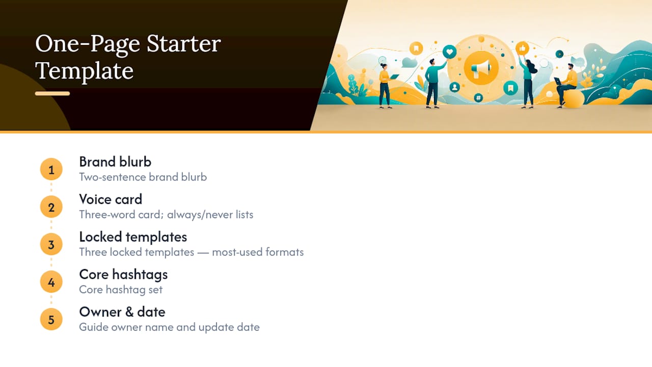
Your one-page starter template should hold five things: a two-sentence brand blurb, your three-word voice card with always/never lists, three locked templates (pick your most-used formats), your core hashtag set, and your guide owner’s name and update date. Keep it to one page, literally, since a guide that requires scrolling through ten pages is a guide nobody opens on a busy Tuesday.
When sharing this with a freelancer or an outside agency, send the one-pager first, before any brand assets, so they absorb the voice before they touch a single template. Attach locked visual files separately, and flag which fields they’re allowed to edit versus which stay untouched.
Why SOL Social Media’s Approach to Style Guides Works
SOL Social Media builds and manages social presences for small businesses across retail and healthcare, and the pattern shows up in nearly every account before a style guide exists: inconsistent captions, mismatched visuals, and a slow drift away from whatever the brand sounded like on day one. Fixing that isn’t about writing a longer document. It’s about writing the right one page and making sure it gets used.
The agency’s approach leans on real human copywriting rather than generic templates, which means the voice card exercise described above isn’t theoretical. It’s the actual first step SOL takes with new clients, because a brand’s authentic voice, translated into concrete always/never rules, produces measurably faster content approval and fewer rewrite cycles. Case work across SOL’s client base shows the same outcome repeatedly: once a small business locks its voice and visual rules, content production speeds up and approval conversations shrink from days to minutes.
None of this requires a large team or a big budget. A retail shop with one part-time social manager benefits from the same one-page discipline as a healthcare practice juggling five locations, because the problem in both cases is the same: too many small decisions, made differently, by too many people.
Accessibility Guidelines for Inclusive Social Content
Accessibility rules belong in your style guide, not as an afterthought, because they affect whether a real portion of your audience can actually read or hear your content at all.
Write alt text for every image, describing what’s visually in the frame in plain language rather than stuffing it with keywords. A product photo needs alt text like “Blue ceramic mug on a wooden table,” not a paragraph of marketing copy.
Caption every video, even short ones, since a meaningful share of viewers watch with sound off by default. Most platforms now offer built-in auto-caption tools, but always review them for accuracy before publishing, since auto-generated captions frequently mangle brand names and technical terms.
Color contrast matters on text-over-image graphics. Light gray text on a white background might look clean on a designer’s monitor and be unreadable for someone with low vision on a phone screen outdoors. Stick to high-contrast combinations for any text your design overlays on an image.
Avoid relying on emoji or hashtags to carry meaning, since screen readers announce emoji literally (a string of flame emoji reads aloud as “fire, fire, fire”), which can turn a caption into nonsense for someone using assistive technology.
Write this into the guide as a standing rule, not a reminder to remember: alt text and captions are mandatory fields on every template, the same way a logo placement is locked. Treating accessibility as optional is how it quietly disappears the first busy week.
Crisis Communication and Handling Negative Comments
Every brand gets a negative comment eventually, and the guide’s job is to remove the guesswork about how to respond before it happens in real time.
Set a response tone that stays calm and specific, regardless of your everyday voice. Even a playful brand should shift to a more measured tone when addressing a complaint, because humor read as dismissive during a real problem does lasting damage. Write two or three sample replies into the guide so whoever’s managing the account that day isn’t drafting a response from scratch under pressure.
Separate complaint types by severity. A comment about slow shipping needs a public acknowledgment and a move to DM. A comment alleging a safety issue or a serious service failure needs immediate escalation to a manager or owner, not a standard scripted reply.
Build in the breaking-news pause rule described earlier under governance: when major news breaks, whoever is on the account has standing authority to pause scheduled content immediately, without waiting for approval. This single pre-authorized rule is one of the most useful things a small guide can include, because the alternative, a scheduled post landing next to unrelated tragic news, is a real risk every brand runs.
Document who has the authority to delete a comment versus who must escalate it first. Small businesses often skip this distinction, and it leads to either overreacting to a mild complaint or under-responding to something serious.
Legal and Compliance Rules Every Guide Needs
Your style guide should spell out a few non-negotiable legal basics, because a caught-off-guard team member is how compliance problems happen.
Disclosure rules apply anytime a post involves a paid partnership, a free product, or a sponsored placement. In the United States, the FTC requires clear disclosure for these relationships, typically through a visible tag like “paid partnership” or “#ad” placed where a reader will actually see it, not buried at the end of a long caption.
Copyright rules need to be explicit about image and music sourcing. Only use photos, illustrations, or music your business owns, has licensed, or has explicit permission to use. Write down which stock libraries or music libraries are pre-approved so nobody grabs an image from a random search result and posts it.
For regulated industries, particularly healthcare, additional rules apply. A healthcare practice posting patient testimonials or before-and-after photos needs written consent on file before anything goes live, and should avoid making specific medical claims in captions without review from whoever handles compliance for the practice.
Trademark and brand name usage should be documented too: how your business name appears in text, whether competitors can be named directly, and how to handle a customer tagging your brand incorrectly. None of these rules need to be long. They need to exist in writing, so a new hire or freelancer isn’t guessing at legal risk on their first week.
Guidelines for Employee and User-Generated Content
Employee-generated content and reposted customer content both need written rules, because both carry risk when they’re left to individual judgment.
For employees posting on personal accounts about work, set a simple standard: they can share that they work for the business and express genuine enthusiasm, but shouldn’t speak as an official spokesperson or share unreleased information. Most small businesses don’t need a lengthy policy here, just a clear line between personal excitement and official brand messaging.
For reposting user-generated content, like a customer photo tagging your brand, always get explicit permission before reposting, even if the original post is public. A simple comment or DM asking “Can we share this?” covers you, and it’s worth writing that exact request into the guide so whoever handles reposts doesn’t have to improvise the wording each time.
Give proper credit every time, tagging the original creator in both the caption and, where the platform allows it, directly on the image. This isn’t just courtesy: it protects your brand from copyright disputes and builds the kind of genuine community relationship that makes customers want to be featured again.
Set a quality bar for reposts too. Not every tagged photo needs to go on your main feed. A blurry or off-brand image can go to Stories instead, where the bar for polish is naturally lower, while your main grid keeps the tighter visual standard your templates already lock in.
What Actually Breaks a Style Guide (and How to Fix It)
The biggest mistake I see in small business style guides isn’t a missing section. It’s length. A twelve-page document with beautiful formatting and zero adoption does less for your brand than a scrappy one-pager someone actually opens before drafting a caption.
The second mistake is treating the guide as finished once it’s written. Voice cards go stale as a business grows, and a guide from two years ago describing a scrappy startup tone doesn’t fit a business that’s since hired a team and moved upmarket.
The third mistake is skipping governance because the team is small. Even a two-person operation benefits from writing down who approves what, because the day you’re both slammed is exactly when a rushed, off-brand post slips through.
For small teams, prioritize in this order: start with the one-page voice card, lock only your non-negotiable visual elements, and let everything else stay flexible until you have a reason to lock it further. Iterate monthly for the first quarter, then settle into the quarterly rhythm described earlier.
The one habit that makes a guide stick: open it before you write, not after you get a note about tone. Building that reflex takes about three weeks of deliberate effort, and after that it’s just how your team works.
— SOL Social Media
Get Help Building or Enforcing Your Style Guide
Writing the guide is one afternoon of work. Getting a whole team, including freelancers and part-timers, to actually follow it day after day is the harder part, and it’s exactly where most small businesses stall out. SOL Social Media closes that gap by doing the work directly: social media audits that catch the inconsistencies before they compound, custom template builds that lock your visual rules into tools your team already uses, and hands-on training sessions that walk your staff through the voice and tone rules until they stick without a reference document open on a second monitor.
A typical starter engagement begins with an audit of your current profiles and content, followed by a working voice card and template set built specifically for your brand, not a generic download. Businesses that go through this process see faster content turnaround and far fewer “does this sound right?” messages once the rules are documented and the team has been walked through them directly. If your feed has started to feel inconsistent, or you’re bringing on a new hire and want them producing on-brand content in week one, explore SOL Social Media’s engagement services to see how a tailored audit and training session could fit your team.
Sources
FAQ
What Should Be in a Social Media Style Guide?
A social media style guide should cover your active profiles, brand voice and tone, visual identity rules, language and grammar defaults, caption formatting, hashtag conventions, governance, and legal or accessibility guidelines, according to Sprout Social’s framework for what brands typically document.
How Long Should a Social Media Style Guide Be?
Short and usable beats long and thorough. A one-page voice card plus a handful of locked templates gets used daily, while lengthy manuals typically go unread after the first week.
Who Should Own the Style Guide in a Small Business?
One person, usually the social media manager or the business owner in very small operations, should own final updates and approvals, even if the whole team contributes to routine posting.
How Often Should We Update Our Style Guide?
Review it quarterly for small fixes like stale hashtags or outdated bios, and run a fuller annual audit to confirm your voice card and locked visuals still match how the business has evolved.
Can SOL Social Media Help Build a Style Guide From Scratch?
Yes. SOL Social Media builds custom voice cards, locked templates, and training sessions for small businesses that need a working guide without hiring a full internal design or content team.
Recommended
Comments