


Six Platform Aware Accessibility Checks for Busy Social Media Teams

Every post needs six checks before it goes live: alt text on images, proofed captions on video, Hashtags formatted with uppercase letters to separate words (CamelCase), descriptive link text, a 4.5:1 color-contrast ratio on text-over-image graphics, and a final read-through for flashing content. These six items form the backbone of any working social media accessibility checklist, and they map directly to WCAG 2.1 AA, the standard the Department of Justice now requires of state and local government content. Auto-captions should be reviewed and corrected by a person before publishing.
TL;DR:
More than just basic checks, each social media post must have alt text, proofed captions, CamelCase hashtags, descriptive links, and high contrast to comply with WCAG 2.1 AA standards.
Alt text should describe meaningful images in under 125 characters, skipping phrases like “image of,” and align captions with the script for accuracy.
Auto-captions require review, with further benefits from adding non-speech audio cues and descriptive text for visual content when possible.
Contrast ratio, font size, and flashing content must meet accessibility standards, with on-image text at 24px or larger and no rapid flashing to prevent seizures.
Implementing accessibility checks into standard workflows and testing content with screen readers ensures inclusive content without significantly increasing workload.
Images and Alt Text: What Actually Belongs in the Description
Every image that carries meaning needs alt text. A product photo, an event flyer, a quote graphic, a chart. All of it needs a text description because screen readers can’t interpret pixels. Purely decorative images, like a plain background texture with no informational role, can skip it. Section508.gov’s guidance treats this as a baseline requirement under WCAG’s rules for non-text content, not an optional nice-to-have.
Writing good alt text is a skill, and it’s a fast one to learn:
Describe what matters to the message, not every visual detail.
Skip phrases like “image of” or “photo of.” Screen readers already announce it’s an image.
Keep it under 125 characters when possible so it reads cleanly.
For charts, infographics, or multi-panel photos, put a short label in the alt text field and a fuller explanation in the caption itself, a practice Section508.gov specifically recommends for dense visuals.
A weak example: “image of a store.” A strong one: “Storefront with a blue awning reading ‘Open Every Day,’ string lights across the entrance.”
Pro Tip: Write your alt text before you write your caption. If you can’t describe the image in one clear sentence, the photo probably needs a caption-level explanation too.
Video and Audio: Captions, Transcripts, and When to Add Description
Every video gets captions, no exceptions. Auto-generated captions are a starting point, not a finished product. USC’s accessibility team recommends proofing every auto-caption before it publishes, since misheard words and dropped punctuation are common. Open (burned-in) captions are the safer bet on platforms where viewers scroll with sound off, which is most of them.
Here’s the workflow that holds up under a real posting schedule:
Generate captions, then proof them against the actual script line by line.
Export or upload as an SRT file where the platform supports it, rather than relying on auto-captions alone.
Include non-speech audio cues in captions (“[phone rings]”, “[crowd cheering]”) since the DOJ’s rule specifies synchronized captions must cover meaningful non-verbal audio.
If the video conveys something visual that the audio doesn’t explain, add a short text description in the caption, or record a quick audio description track.
Pro Tip: Keep your raw script file. It doubles as your transcript and cuts your captioning time in half on the next post.
Copy, Hashtags, Links, and Emoji: Writing for Screen Readers
Small wording choices decide whether a screen reader user follows your post or bails halfway through.
Write in plain language. Short sentences and active voice help people with cognitive disabilities and screen-reader users alike, since fewer clauses mean less to parse.
Format hashtags in CamelCase. #SmallBusinessMarketing reads correctly; #smallbusinessmarketing gets announced as one long garbled word, a distinction Accessiway’s guidance calls out directly. Place hashtags at the end of the post so they don’t interrupt the sentence flow.
Ditch “click here.” Descriptive link text like “see our spring lookbook” tells a screen reader user where the link goes; generic phrasing gives them nothing to work with. Note when a link opens a new tab.
Use emoji sparingly. Screen readers announce each one individually, so a string of five emojis becomes five interruptions in a row. Place a single emoji at the end of a sentence, never stacked mid-thought.
Visual Design: Contrast, Text-on-Image, and Flashing Content
Text overlaid on a photo needs to hit a 4.5:1 contrast ratio for normal-size text and 3:1 for large text, the same minimum standard used across web accessibility guidelines. Free tools like WebAIM’s Contrast Checker or the Colour Contrast Analyser let you paste in your background and text colors and get a pass/fail in seconds.
Keep on-image text short. One idea per graphic, not a paragraph crammed into a square.
Size text large enough to read on a phone screen at arm’s length, generally 24px or larger for anything meant to be read quickly.
Avoid flashing or rapidly looping animations. Anything flashing more than three times per second risks triggering seizures in people with photosensitive epilepsy, so if a GIF loops fast, slow it down or cut it.
Test contrast before you post, not after a follower flags it.
Where to Add Alt Text and Captions on Every Platform
Settings hide in different menus depending on the network, and platform behavior shifts often enough that it’s worth a quick reference.
Instagram: Add alt text under “Advanced Settings” before publishing a photo post. Auto-captions are available for Reels and Stories, but they’re inconsistent, so proof them.
X: Alt text lives in a small “+ALT” button on the image itself. Captions for video accept uploaded SRT files, which is the more reliable route than auto-captioning.
Facebook: Alt text auto-generates but can be edited manually before posting. Video supports SRT uploads directly in the publishing tools.
LinkedIn: Accepts SRT uploads for video captions, and the platform’s own guidance recommends disabling auto-captions first, then uploading your corrected file.
TikTok: Auto-captions turn on by default in editing; review and correct them before you post, since TikTok doesn’t currently support SRT uploads.
Story and GIF behavior differs by network too. Some platforms auto-caption Stories, others don’t caption them at all, so check before assuming a feature carried over from the main feed.
The Final Checklist to Run Before You Hit Publish
Run this in order, every time, before scheduling anything:
Alt text written and entered for every meaningful image.
Captions uploaded, proofed against the script, and non-speech cues included.
Text-on-image contrast checked against 4.5:1 (or 3:1 for large text).
Hashtags formatted in CamelCase and placed at the post’s end.
Links written descriptively, with new-tab behavior noted where relevant.
Emojis limited and placed at sentence ends, not stacked.
One team member signs off before the post goes live.
Checklist item | Owner | Quick test |
Alt text | Writer | Read it aloud. Does it make sense without seeing the image? |
Captions | Editor | Play the video muted. Can you follow the story? |
Contrast | Editor | Run colors through a contrast checker. |
Hashtags | Scheduler | Confirm CamelCase, placed at the end. |
Links | Writer | Would a stranger know where this leads? |
Build this into whichever scheduling tool or content calendar your team already uses, so it’s a step in the workflow rather than an afterthought squeezed in before publish.
Building Accessibility Into a Real Team Workflow
On a small team, the writer drafts alt text and captions alongside the copy, not after. The editor proofs captions against the script and checks contrast before approving. The scheduler does one last pass for hashtag casing and link phrasing before it goes out. Folding these checks into an existing content audit process keeps accessibility from becoming a separate, skippable task.
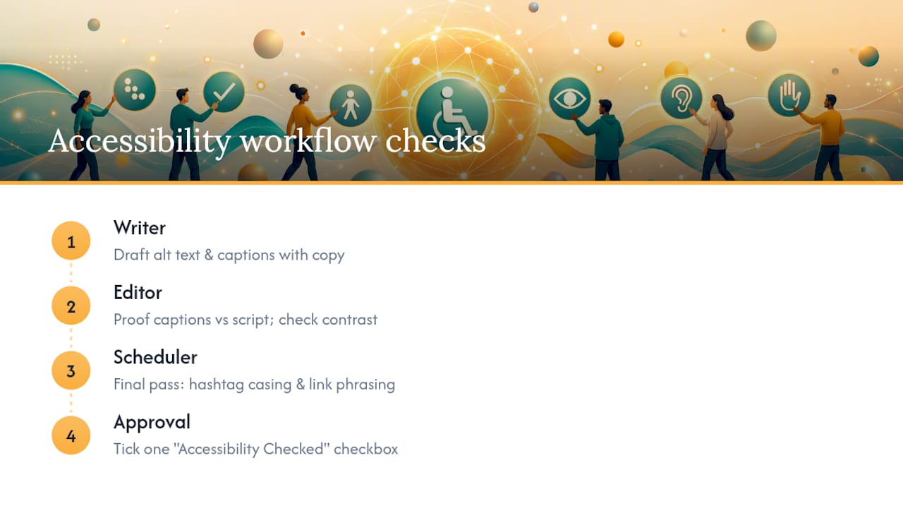
Pro Tip: Add a single “Accessibility Checked” column to your content calendar. One checkbox per post is enough to catch what a rushed morning would otherwise miss.
Keyboard Navigation and Focus Indicators
Not every accessibility gap lives inside the post itself. A lot of it lives in how someone reaches your content in the first place, and that’s where keyboard navigation comes in. People who can’t use a mouse, whether from a motor disability, a temporary injury, or a preference for efficiency, navigate using the Tab key to jump between links, buttons, and form fields.
On your own website or landing pages linked from social bios, every interactive element needs a visible focus indicator, a highlighted outline showing which element is currently selected. Most browsers show this by default, but plenty of custom website themes strip it out for a cleaner look, which locks keyboard users out entirely. If your bio link leads to a landing page you built or customized, tab through it yourself. If you lose track of where you are on the page, so will your visitor.
Social platforms themselves handle most keyboard navigation on their own interfaces, so this rule matters most for anything you control directly: your website, your link-in-bio page, your email sign-up form. A few practical checks:
Tab through your linked landing page from top to bottom. Every button and link should get a visible outline.
Never disable the default focus outline in your website’s custom CSS unless you’re replacing it with something equally visible.
Test that dropdown menus and pop-ups can be closed with the Escape key, not just a mouse click.
This isn’t glamorous work, but it’s the difference between a visitor completing a signup and abandoning it in frustration.
Accessible Font Sizes and Styles
Font choice on social graphics is one of the most common accessibility failures, and one of the easiest to fix. Text that looks fine on a designer’s 27-inch monitor often becomes unreadable at thumbnail size on a phone screen.
A few working rules for any graphic with text:
Set body text at a minimum of 24px on square or vertical graphics meant for feed viewing.
Avoid thin or ultra-light font weights. They lose legibility fast against busy backgrounds.
Skip decorative script fonts for anything beyond a short headline. They’re genuinely difficult for people with dyslexia and low vision to parse.
Left-align paragraph text rather than centering it. Centered text forces the eye to hunt for the start of each new line, which slows reading for everyone and creates a real barrier for people with cognitive or attention-related disabilities.
Leave breathing room between lines. Cramped line spacing makes text blur together, especially on smaller screens.
On your website or app, this extends further: body copy generally needs to sit at 16px or larger, with headings scaled up clearly enough to establish a visual hierarchy someone can navigate by size alone. If you’re building a landing page to support a campaign, resist the pull toward tiny, stylized fonts just because they look sleek in a mockup. A graphic nobody can read doesn’t convert, no matter how good the design looks in isolation.
Use of ARIA Roles and Landmarks
ARIA (Accessible Rich Internet Applications) roles and landmarks matter most on the websites and landing pages behind your social links, not inside the posts themselves, since Instagram, X, and Facebook control their own underlying code. If you’re managing a website, a link-in-bio page, or a campaign landing page, ARIA is where a lot of invisible accessibility work happens.

Landmarks are labels in the code that tell assistive technology what each section of a page is: navigation, main content, footer, search. Without them, a screen reader user has to listen through an entire page top to bottom just to find the contact form, instead of jumping straight to it. Roles work the same way for interactive elements, telling a screen reader that a clickable box is a “button” rather than just an unlabeled div.
A few practical notes if you or your web developer are building out pages that support your social campaigns:
Use native HTML elements (<button>, <nav>, <main>) before reaching for ARIA attributes. Semantic HTML does most of this work automatically.
Only add ARIA roles when a custom-built element needs one, such as a JavaScript-driven dropdown menu that doesn’t use a native <select> tag.
Never add an ARIA role that contradicts what an element visually does. A styled <div> acting as a button needs role="button", not role="link".
If your team doesn’t have a developer handling this, it’s worth a conversation with whoever built your website. Misapplied ARIA is a known problem. It can make a page less accessible than having no ARIA at all.
Testing With Assistive Technologies
Reading a checklist is one thing. Watching your own post move through a screen reader is another, and it catches problems that a visual review never will.
VoiceOver, built into every iPhone and Mac, is the fastest way to test your own content. Turn it on, then scroll through your Instagram feed or open your website with your eyes closed. Notice where the flow breaks: an image with no alt text gets read as “image,” a hashtag in lowercase gets mangled into one long word, a “click here” link tells you nothing about where it leads. Android users can run the same kind of test with TalkBack, and Windows users have NVDA, a free screen reader that works well for testing websites and landing pages.
Voice command testing matters too, particularly for anyone building forms, sign-ups, or interactive campaign pages. Tools like Dragon or built-in options like Voice Access on Android let you test whether someone navigating entirely by spoken command can actually complete the action you’re asking for, like filling out a contact form linked from your bio.
You don’t need to run a full audit on every single post. But running your top-performing content, your pinned posts, and your website’s key pages through a screen reader once a quarter will surface problems no visual checklist catches. It’s the closest thing to seeing your content the way a screen reader user actually experiences it.
Guidelines for Accessible Live Video and Stories
Live video and Stories move fast, which is exactly why they’re easy to get wrong on accessibility. There’s no editing pass before it goes out, so the habits need to be built in ahead of time, not fixed after the fact.
For live streams, turn on auto-captions if the platform offers them, but understand they’ll be rougher than a pre-recorded video’s captions since there’s no chance to proof them in real time. Narrate visual moments out loud as you go. If you’re showing a product, a graph, or a written sign during a livestream, say what it shows rather than assuming viewers can see it clearly on a small, possibly buffering screen.
For Stories, a few habits carry the most weight:
Add alt text or a text overlay describing any image-only Story slide, since Stories often skip past too fast for someone using a screen reader to catch context otherwise.
Avoid flashing transitions, strobing filters, or rapid-fire slide changes. The same seizure-risk threshold applies here as anywhere else.
Keep text overlays on Story slides large and high contrast, since Stories are almost always viewed on a phone held at a distance, often outdoors in bright light.
If a Story includes a poll, quiz sticker, or swipe-up link, describe what it does in your own narration or caption, since interactive stickers aren’t always labeled clearly for assistive technology.
Why Accessible Social Is Smart Marketing
Accessibility isn’t a compliance chore bolted onto marketing. It’s the fastest way to stop excluding a real segment of your audience by default. Every caption proofed and every alt text written is one more person who can actually see, hear, and act on what you post. We’d rather see every small business run this checklist than skip it. Adopt it, and watch who starts showing up.
— SOL Social Media
Get Help Putting This Checklist Into Practice
Running this checklist on every single post, every single week, is a real time commitment, and most small business owners are already stretched between the actual work and the marketing that’s supposed to bring in more of it. A dedicated team can handle the accessibility work inside your regular posting schedule instead of asking you to add it on top of everything else.
Our social media engagement services cover managed posting with captions proofed and alt text written before anything goes live, alongside audits that catch what’s already slipping through on your current feed. For teams that want to keep publishing in-house but need the habits to stick, staff training sessions built around checklists like this one are available. If you’d rather see where your own account currently stands, a social media audit is the fastest way to find out, and it’s the natural first step before booking either managed posting or a training session with our team.
Sources
For the legal backbone, review the DOJ’s WCAG 2.1 AA rule and Section508.gov’s social media guidance. For measurement, a contrast checker and a screen reader like VoiceOver or NVDA cover most day-to-day testing needs. Teams building broader measurement frameworks around audits can also reference AuthorityLayer’s playbook on structuring recurring checks.
FAQ
What Is the Minimum Color Contrast Ratio for Social Graphics?
Normal-size text needs a 4.5:1 contrast ratio against its background, while large text can drop to 3:1 and still read clearly for people with low vision.
Should I Trust Auto-Generated Captions?
No, not without review. Auto-captions are a useful starting point, but they miss words, punctuation, and non-speech sounds often enough that manual proofing before publishing is standard practice.
How Should I Format Hashtags for Accessibility?
Use CamelCase or PascalCase, like #SmallBizTips instead of #smallbiztips, so screen readers announce each word separately instead of one garbled string.
Do I Need Alt Text on Every Image I Post?
Alt text is needed on any image that carries information, meaning most product photos, graphics, and event flyers, but purely decorative backgrounds can be skipped.
Can SOL Social Media Handle Accessibility for My Posts?
Yes. SOL Social Media’s managed social engagement services build alt text, caption proofing, and contrast checks directly into the posting workflow for small business clients.
Recommended
Comments