


Batch 9–12 Posts: Agency Instagram Grid Layouts for Small Businesses
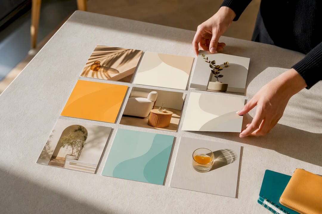
An Instagram grid layout is the three-column view of your profile, and planning it means ordering your posts so all nine, twelve, or more images read as one visual set instead of a random stack. The single next action is simple: pick a layout style and preview your next nine posts in a grid planner like Planoly or UNUM before you publish anything. Tools like Canva handle the design side, and an experienced social media agency can build the system for you if you’d rather not manage it alone.
TL;DR:
A grid pattern with two content pillars is sustainable with a busy posting schedule, but complex layouts like color-flow require dedicated management.
Use tools like grid planners or templates in Canva to preview and arrange posts in the correct sequence before publishing to maintain consistency.
Design images at 1080x1350 pixels for portrait posts, ensuring key subjects are centered to avoid cropping issues in thumbnails and reels covers.
Establish brand rules with a fixed color palette, fonts, and templates to scale grid consistency across multiple content creators.
Refresh the grid based on engagement metrics and seasonal shifts, testing new layouts on nine to twelve posts to gauge effectiveness.
What Are the Best Instagram Grid Layout Styles?
Your layout style should match your content volume and how much time you actually have to produce it, not just what looks good on Pinterest.
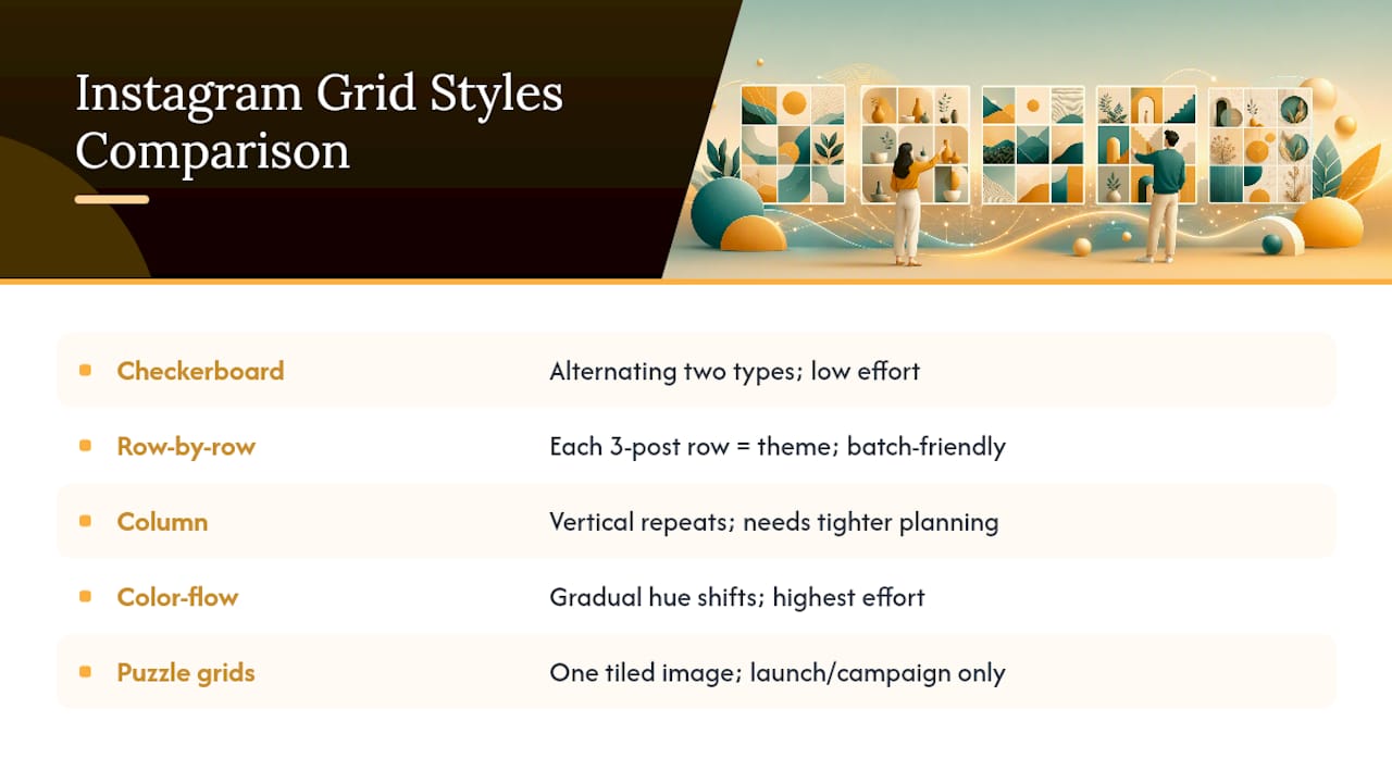
Checkerboard alternates two content types, like product shots and lifestyle photos, in a repeating pattern. It’s low effort once you set the rule and works well for retail brands with a steady stream of product photography.
Row-by-row treats each horizontal line of three as its own mini-composition. This suits storytelling brands and food or travel accounts that shoot in batches, since you can plan a full row around one theme, then move to the next.
Column layout repeats a pattern down each vertical line instead of across rows. It reads well on mobile scroll but takes tighter planning because you’re managing three separate sequences at once.
Color-flow grids gradually shift hue or brightness across the whole feed. It’s the highest-effort style, best for brands with strong art direction and a big enough content library to control for color at all times.
Puzzle grids split one large image into tiles across multiple posts. They generate a strong first impression but only work as a launch or campaign tactic. You can’t build an entire feed around them.
Match ambition to capacity. A checkerboard pattern with two content pillars will survive a busy quarter. A full color-flow grid usually won’t unless someone is managing it full time.
How Do I Plan and Publish a Cohesive Instagram Grid?
Planning a grid is a production process with a fixed order, not a creative afterthought you tack on before hitting post.
Set your brand rules first. Lock in a color palette, one filter or preset, consistent fonts for text overlays, and a template structure with defined zones that never move.
Choose three to five content pillars and pick a layout pattern that maps cleanly to them. A wellness practice might run education, testimonials, behind-the-scenes, and offers as its four pillars in a checkerboard rotation.
Assemble your next nine to twelve posts and order them by brightness or color flow rather than by the date each was shot. Preview the full set in a grid planner before touching the schedule.
Export or schedule in posting order. Some planners push straight to Instagram in sequence; others require you to save images in the correct order and upload manually. If a post lands wrong, Instagram lets you reorder items in a draft before it goes live, but once something is published, moving it means deleting and reposting.
Build an operational routine around templates, batch shoot days, a caption framework you reuse, and a scheduling block on your calendar.
Pro Tip: Shoot and edit in batches of nine. Trying to plan one post at a time makes brightness and color drift almost impossible to catch until it’s already live.
What Image Sizes and Safe Zones Work Best for a Grid?
Design at 1080×1080 pixels for square posts, but most creators now build at 1080×1350 (a 4:5 portrait ratio) because it takes up more vertical space in the feed and grid thumbnail alike, giving your content more visual weight per post.
Grid thumbnails crop portrait and landscape images to a square, so keep key subjects centered rather than near the edges.
Reel covers and carousel first frames need the same center safe zone, since Instagram trims from the sides first.
For puzzle grids, export tiles at matching resolution and check the seams in a planner preview before uploading; a mismatch of even a few pixels shows up as a visible gap.
An online image splitter will slice one large image into a 3x3 or custom grid and let you download every tile without creating an account.
Guides on feed design consistently point to nine to twelve posts, or three full rows, as the minimum needed before a pattern actually becomes visible to someone scrolling your profile. Fewer than that, and checkerboard or color-flow effects just look like noise.
Which Tools Help You Plan and Preview a Grid?
The right tool depends on whether you’re building one campaign or running an ongoing feed.
Online splitters work best for single-use puzzle grids. Upload one image, download the tiles, post in order, and you’re done. No app, no login, no ongoing subscription.
Grid planner apps like Planoly, UNUM, and OneUp offer drag-and-drop previews so you can drop upcoming posts into a mock feed and see how they sit against what’s already published. Several, including OneUp, also let you reorder posts or schedule them directly, which matters when a last-minute post needs to slot into a specific spot without wrecking your color flow.
Template-first workflows in Canva or Figma give you locked zones (logo placement, brand colors, font) and editable zones (photo, headline) so a whole team can produce on-brand posts without redesigning from scratch each time. Canva’s free grid templates are a solid starting point if you’re building this system for the first time.
The tradeoff is real: splitters are fast but limited to one-off projects, planners save scheduling time but add a monthly cost, and template systems take longer to set up but scale best once more than one person is producing content.
How Do You Keep a Grid Consistent at Scale?
Consistency breaks down the moment more than one person is creating content, unless you’ve built a system that doesn’t depend on memory.
Build a minimum template set: one for announcements, one for tutorials, one for quotes, one for product shots, one for promotions. Five templates cover most small business content needs.
Lock the zones that carry your brand (color block, logo placement, font) and leave only the photo and headline editable. This is exactly how template architecture scales consistency across a team without a designer reviewing every post.
Batch nine to twelve posts at a time, preview the set, then schedule. This is the workflow an experienced social media agency might hand off to clients who want a repeatable system rather than a one-time design favor.
Watch profile visit to follow conversion as your primary metric. A cohesive grid should be doing measurable work, not just looking tidy. If engagement is stalling despite a clean feed, the layout probably isn’t the problem.
Pro Tip: Bump exposure or brightness by a consistent small amount across every edit, even on very different content types. Uneven brightness is the fastest way to make a grid look unplanned, even when the color palette is technically correct.
How Do Reels, Videos, and Stories Fit Into a Grid?
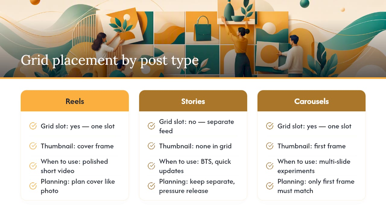
Reels and video posts occupy grid slots the same way static images do, but their thumbnails behave differently and need separate planning.
A Reel’s grid thumbnail is whatever frame you select as the cover, so treat that cover image with the same care as a photo post: center the subject, match your color palette, and avoid a random paused frame that clashes with the rest of the row. Most planner apps let you upload or preview a custom Reel cover before it publishes, which matters because Instagram’s auto-selected frame is rarely the best one for your feed’s visual flow.
Stories don’t appear in the grid at all, since they’re a separate, temporary feed. That makes Stories the ideal place to post behind-the-scenes content, quick updates, or anything that doesn’t fit your grid’s aesthetic without disrupting it. Use Stories as pressure release. If you have something worth sharing that breaks your color palette or pillar structure, it goes there instead of the main feed.
Carousels count as one grid slot regardless of how many images are inside, so only the first frame needs to match your surrounding posts visually. That gives you room to get more experimental with slides two through ten, since they only appear once someone taps into the post.
The practical rule: plan static posts and Reel covers together in your grid preview, keep Stories separate, and treat carousel first frames like any other grid image.
What Mistakes Ruin an Otherwise Good Grid Layout?
The most common mistake is designing a layout that’s more ambitious than your content pipeline can sustain. A color-flow grid looks stunning in a mockup and then falls apart three weeks later when you’re too busy to shoot on-theme content and end up posting whatever’s available.
Posting out of sequence is a close second. Uploading one post at a time without checking a preview means you find out a pattern broke after it’s already live, and fixing it usually means deleting and reposting, which costs you the original engagement.
Ignoring brightness consistency is a quieter problem. Two posts can share a color palette and still clash badly if one is shot in bright daylight and the other in dim indoor light. Match exposure levels, not just hue.
Overloading the grid with promotional content is another frequent misstep. If every third post is a sales pitch, the pattern reads as an ad feed instead of a brand, and viewers start scrolling past instead of stopping.
Finally, treating the grid as permanent decoration rather than a living system causes accounts to go stale. A layout that was distinctive a year ago can look dated or repetitive today, especially if your content pillars haven’t evolved alongside your business.
When Should You Refresh Your Grid Layout?
Refresh your grid when engagement metrics tell you to, not on a fixed calendar. If profile visits are climbing but your follow rate is flat, the aesthetic may no longer match what a new visitor expects from your brand.
Seasonal shifts are a natural refresh point. Retail accounts often adjust palette and content pillars around major shopping periods, while service businesses might refresh templates after a rebrand or a new service launch.
A practical refresh doesn’t mean deleting old posts. It means updating your template set, testing a new layout style on the next nine to twelve posts, and comparing engagement before committing further. Treat each new content pillar rotation as a small experiment rather than a permanent overhaul. Give a new pattern at least three rows before deciding whether it’s working.
Why Grid Planning Actually Moves Marketing Numbers
A cohesive grid does real work at the moment someone lands on your profile and decides whether to hit follow. That first impression, built across nine visible posts, often carries more weight than any single caption and benefits from integrating social media into your advertising strategy for maximum impact. Reels reward posting frequency and watch time more than strict visual matching, so balance both: keep the grid intentional, but don’t sacrifice Reels output chasing perfect color flow. Review performance every few weeks and adjust instead of setting the grid once and forgetting it.
— SOL Social Media
How SOL Social Media Builds Grid Strategy Into Your Content
If reading through all of this made your stomach sink a little at the thought of doing it every week, that reaction is common and worth listening to. SOL Social Media’s Social Media Content Creation service builds the templates, batches the shoots, and manages the posting order so your grid stays consistent without eating your Tuesday afternoons.
The decision to bring in help usually comes down to three signals: you’re too stretched to plan content more than a few days ahead, your results have been inconsistent despite effort, or you’re ready to grow past what one person can manage alone. Our Social Media Strategy service builds the content pillars and layout system first, so every future post has a defined place before it’s even shot. For business owners who want to keep creating in-house but need the framework built for them, Customized Social Media Training walks your team through the same production process an agency would run internally. Check current plans and pricing on our Monthly Unlimited and Weekly Consulting page, or book a consult to talk through what your grid needs right now.
Tools and Guides Worth Bookmarking
For hands-on building, Canva’s free grid templates offer ready-made starting layouts. For splitting a single image into a puzzle grid, try an online image splitter. For a deeper walkthrough of feed planning mechanics, this guide on planning your Instagram feed grid covers the row-based logic in more depth.
Sources
FAQ
How do I do a grid layout on Instagram?
Choose a layout style, such as checkerboard or row-by-row, then use a grid planner app like Planoly or UNUM to arrange and preview your next nine to twelve posts before publishing any of them.
What is the best grid layout for Instagram?
There’s no single best layout. Checkerboard suits low-effort consistency for product-based brands, while row-by-row favors storytelling accounts with strong batch photography. The right choice depends on your content pillars and production capacity.
Can I rearrange the grid on Instagram?
You can reorder posts that are still in draft or scheduled state within most planner apps, but once a post is live on your profile, moving its position means deleting and reposting it.
Is the Instagram grid 4:5 or 3:4 or square?
Instagram displays grid thumbnails as square crops, but you can upload posts at 1080×1350 (a 4:5 ratio), which Instagram displays in full in the single-post view while still cropping to square for the grid thumbnail.
How many posts should I plan to establish a grid aesthetic?
Plan at least nine to twelve posts, or three full rows, since a visual pattern like checkerboard or color-flow only becomes recognizable once there’s enough content on screen at once.
Recommended
Comments